Monitor#
Overview#
These recipes and diagnostics allow plotting arbitrary preprocessor output, i.e., arbitrary variables from arbitrary datasets. In addition, a base class is provided that allows a convenient interface for all monitoring diagnostics.
Available recipes and diagnostics#
Recipes are stored in recipes/monitor
recipe_monitor.yml
recipe_monitor_with_refs.yml
Diagnostics are stored in diag_scripts/monitor/
monitor.py: Monitoring diagnostic to plot arbitrary preprocessor output.
compute_eofs.py: Monitoring diagnostic to plot EOF maps and associated PC timeseries.
multi_datasets.py: Monitoring diagnostic to show multiple datasets in one plot (incl. biases).
User settings#
It is recommended to use a vector graphic file type (e.g., SVG) for the output
files when running this recipe, i.e., run the recipe with the command line
option --output_file_type=svg or use output_file_type: svg in your
User configuration file.
Note that map and profile plots are rasterized by default.
Use rasterize_maps: false or rasterize: false (see Recipe settings)
in the recipe to disable this.
Recipe settings#
A list of all possible configuration options that can be specified in the recipe is given for each diagnostic individually (see previous section).
Monitor configuration file#
In addition, the following diagnostics support the use of a dedicated monitor configuration file:
monitor.py
compute_eofs.py
This file is a yaml file that contains map and variable specific options in two
dictionaries maps and variables.
Each entry in maps corresponds to a map definition.
Example:
maps:
   global: # Map name, choose a meaningful one
      projection: PlateCarree # Cartopy projection to use
      projection_kwargs: # Dictionary with Cartopy's projection keyword arguments.
         central_longitude: 285
      smooth: true # If true, interpolate values to get smoother maps. If not, all points in a cells will get the exact same color
      lon: [-120, -60, 0, 60, 120, 180] # Set longitude ticks
      lat: [-90, -60, -30, 0, 30, 60, 90] # Set latitude ticks
      colorbar_location: bottom
      extent: null # If defined, restrict the projection to a region. Format [lon1, lon2, lat1, lat2]
      suptitle_pos: 0.87 # Title position in the figure.
Each entry in variables corresponds to a variable definition.
Use the default entry to apply generic options to all variables.
Example:
variables:
   # Define default. Variable definitions completely override the default
   # not just the values defined. If you want to override only the defined
   # values, use yaml anchors as shown
   default: &default
      colors: RdYlBu_r # Matplotlib colormap to use for the colorbar
      N: 20 # Number of map intervals to plot
      bad: [0.9, 0.9, 0.9] # Color to use when no data
   pr:
      <<: *default
      colors: gist_earth_r
      # Define bounds of the colorbar, as a list of
      bounds: 0-10.5,0.5 # Set colorbar bounds, as a list or in the format min-max,interval
      extend: max # Set extend parameter of mpl colorbar. See https://matplotlib.org/stable/api/_as_gen/matplotlib.pyplot.colorbar.html
   sos:
      # If default is defined, entries are treated as map specific option.
      # Missing values in map definitionas are taken from variable's default
      # definition
      default:
         <<: *default
         bounds: 25-41,1
         extend: both
      arctic:
         bounds: 25-40,1
      antarctic:
         bounds: 30-40,0.5
   nao: &nao
      <<: *default
      extend: both
      # Variable definitions can override map parameters. Use with caution.
      bounds: [-0.03, -0.025, -0.02, -0.015, -0.01, -0.005, 0., 0.005, 0.01, 0.015, 0.02, 0.025, 0.03]
      projection: PlateCarree
      smooth: true
      lon: [-90, -60, -30, 0, 30]
      lat: [20, 40, 60, 80]
      colorbar_location: bottom
      suptitle_pos: 0.87
   sam:
      <<: *nao
      lat: [-90, -80, -70, -60, -50]
      projection: SouthPolarStereo
      projection_kwargs:
         central_longitude: 270
      smooth: true
      lon: [-120, -60, 0, 60, 120, 180]
Variables#
Any, but the variables’ number of dimensions should match the ones expected by each plot.
Example plots#
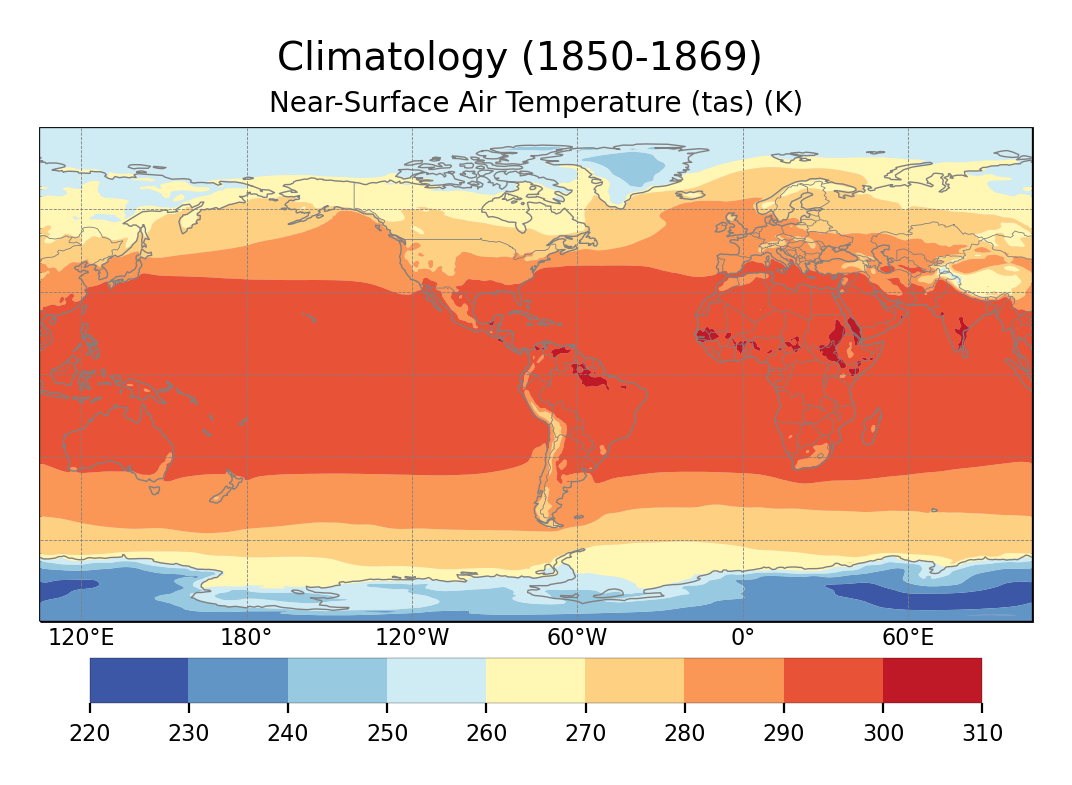
Global climatology of tas.
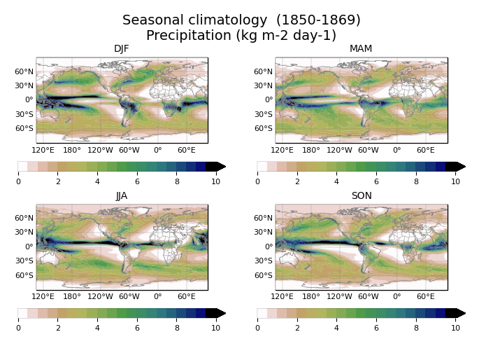
Seasonal climatology of pr, with a custom colorbar.
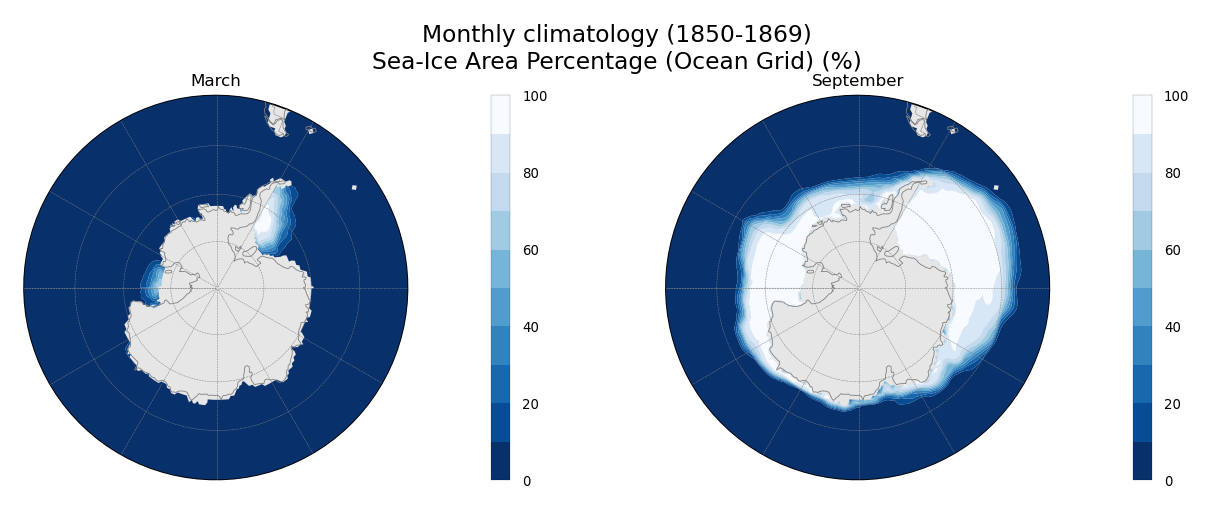
Monthly climatology of sivol, only for March and September.
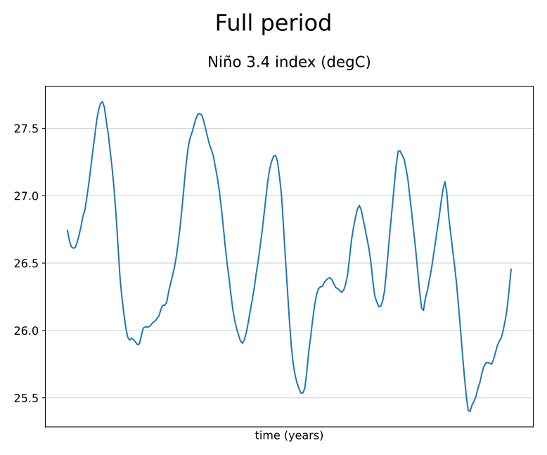
Timeseries of Niño 3.4 index, computed directly with the preprocessor.
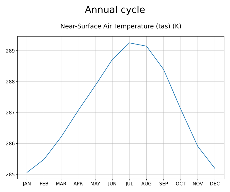
Annual cycle of tas.
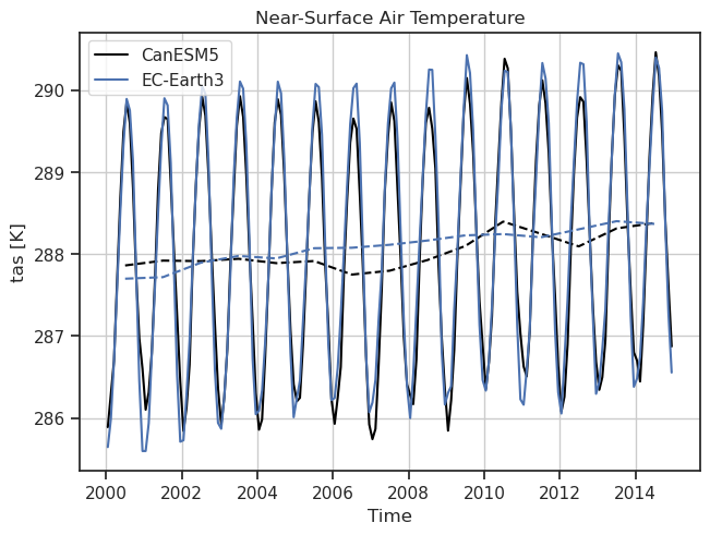
Timeseries of tas including a reference dataset.
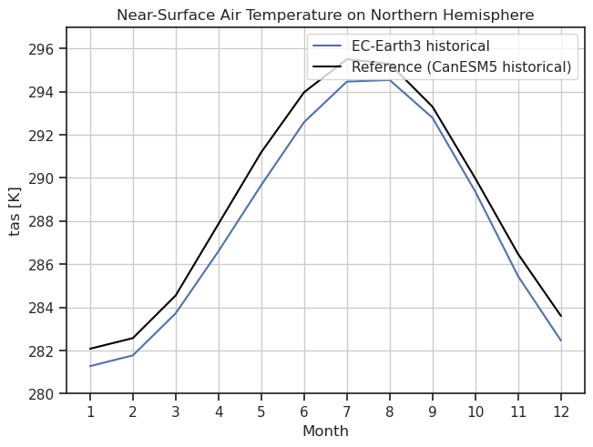
Annual cycle of tas including a reference dataset.
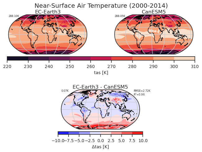
Global climatology of tas including a reference dataset.
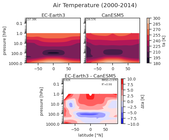
Zonal mean profile of ta including a reference dataset.
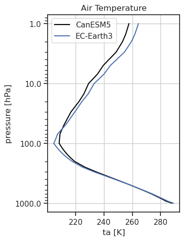
1D profile of ta including a reference dataset.
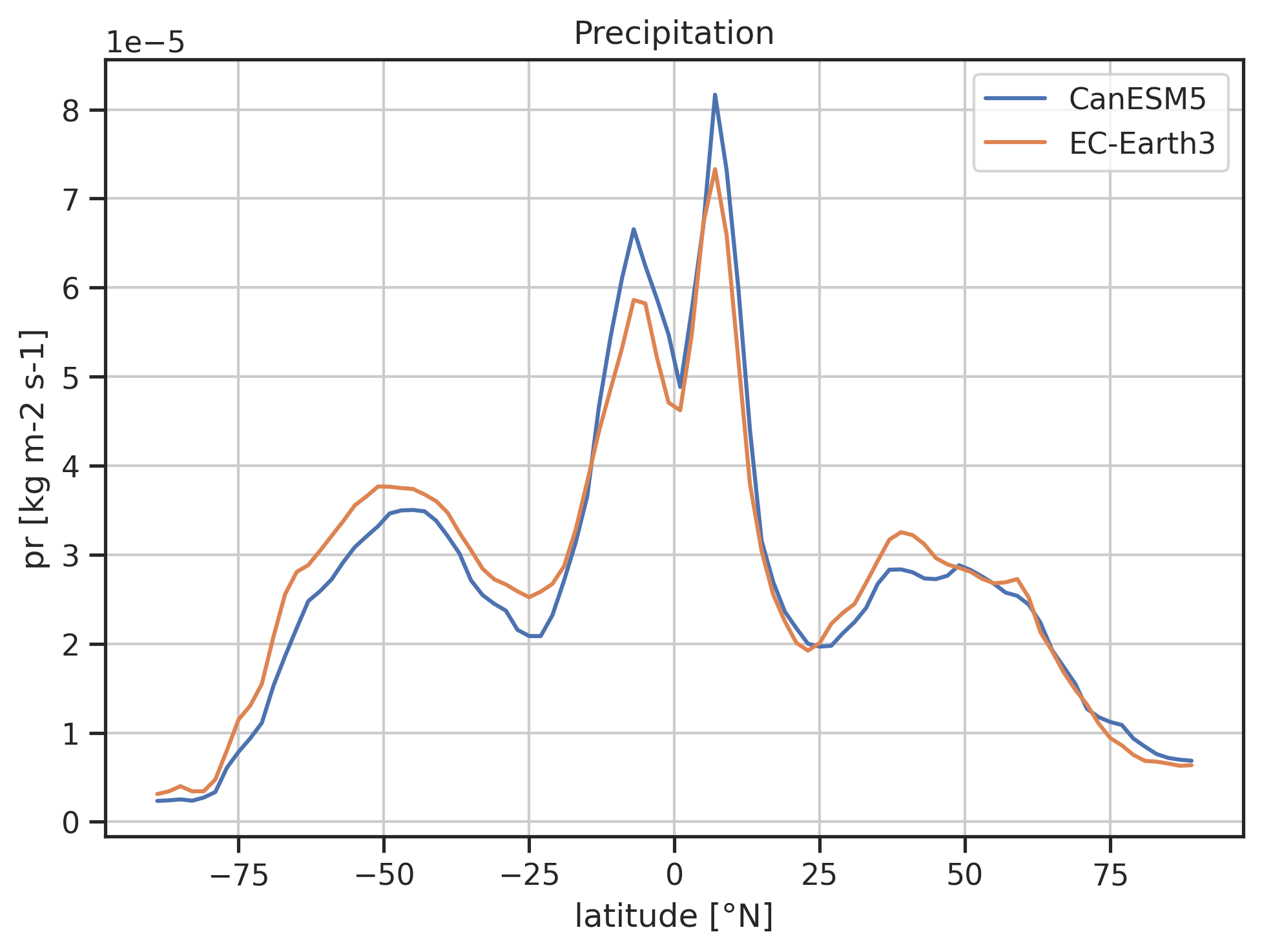
Zonal mean pr including a reference dataset.
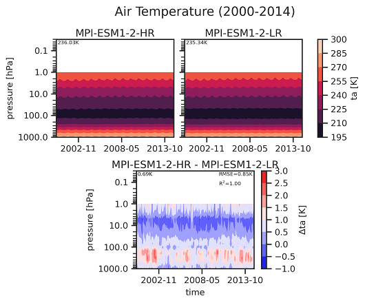
Hovmoeller plot (pressure vs. time) of ta including a reference dataset.
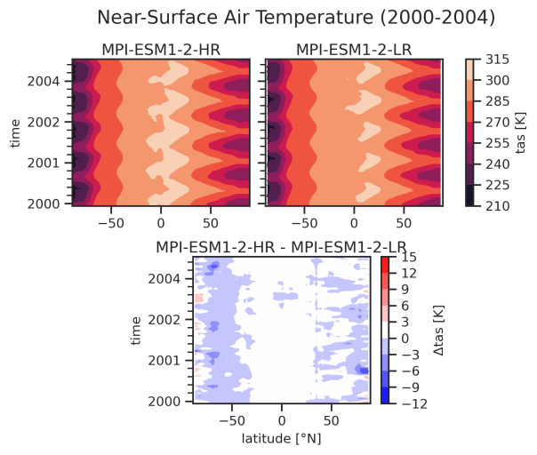
Hovmoeller plot (time vs. latitude) of tas including a reference dataset